


Colour psychology: behind the science
From Isaac Newton to Goethe and Schopenhauer, artists, scientists and philosophers have long been fascinated by colour’s influence on our mood and behaviour. Using the four primary psychological colours identified by Swiss psychoanalyst Carl Jung, we’ve devised a nifty guide to help you find the perfect shade to introduce into your home. Scroll down to find out more!

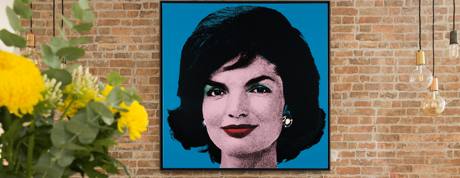
Blue
The world’s most popular colour is associated with stability, trustworthiness and tranquility. So much so, it’s even thought to prevent nightmares! It has been used in art since ancient times. During the Renaissance, semi-precious stones were crushed and used as ultramarine, which is one of the most expensive pigments.

Red
In ancient Egypt, red was considered a symbol of vitality and celebration but also evil and destruction. Thought to activate the ‘fight or flight’ response, the pigment can be sourced from natural clay, iron oxides and the cochineal insect. In fact, red was one of the first colours used in prehistoric art. In Asian cultures, it symbolises good fortune and happiness.
Featured artist: Raphael Mazzucco

Yellow
As the most visible colour of the spectrum (due to the way it excites our eyes), yellow is often associated with warmth, positivity and the sun. Applied colour psychology expert Karen Haller revealed in our Fine Art Collector magazine that: “Just a little bit of yellow can bring a sense of brightness and happiness.”
Featured artist: Paul Stephenson

Green
Nature, empathy, kindness and luck are just a few of the positive associations we have with the colour green. However, there may be something to its link with jealousy and the green-eyed monster. As high-quality green pigment is difficult to source, painters have historically guarded their secret formulae!
Featured artist: Richard Rowan
If you'd like an expert opinion, you can talk to an art consultant.
