

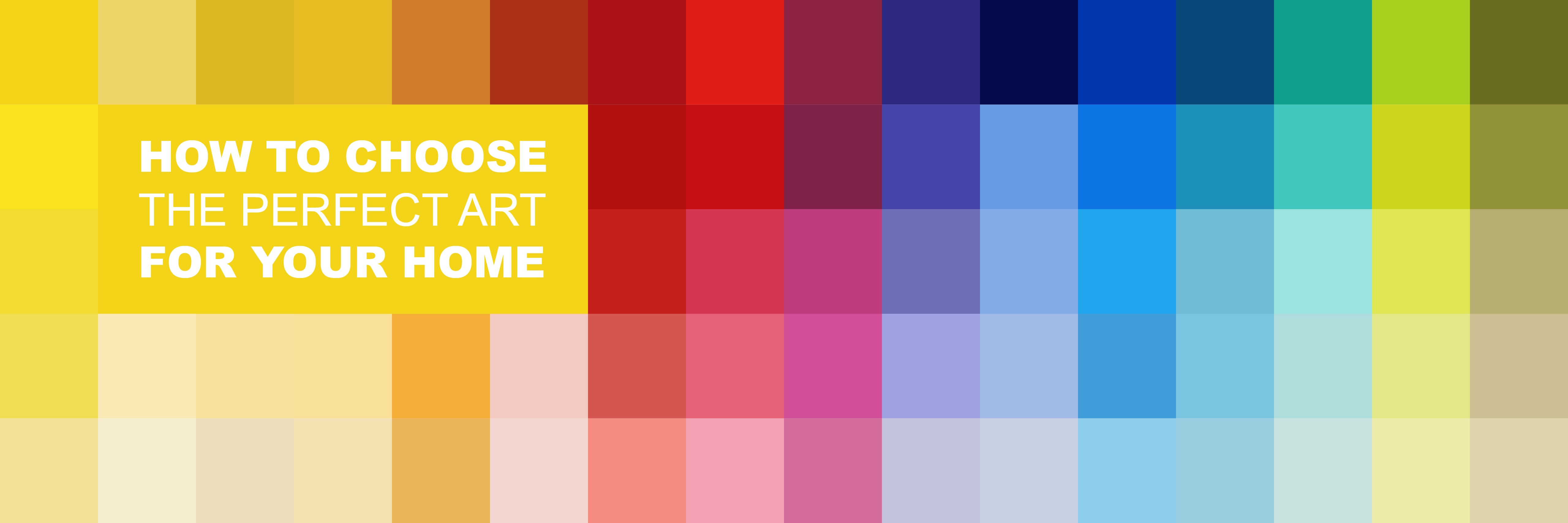
Our easy colour theory guide: find your perfect piece!
When you are are planning to refresh your home with new art, where should you start? If you're tired of scrolling through Pinterest and Instagram, we've got lots of useful tips to help you choose the best colours and styles for you. Here's our back-to-basics guide on colour theory to get you started.

Complementary colour schemes

This is where the colour wheel will be your best friend. Complementary colours sit opposite each other on the wheel and are considered the most established combinations. For example: blue and orange, red and green, yellow and purple. Working within these pairings makes it easy to make colours pop and elevate elements in any given room. Traditionalists will tell you that complementary colour schemes are best suited to more formal rooms (such as dining rooms), but we think they work well anywhere!
Featured art (L-R): Richard Rowan, 'Vanilla Skies' and 'Pretty in Pink'.
Monochrome colour schemes
 Contrary to popular belief, this does not mean simply black and white. A monochrome colour scheme is created by using various tones and shades of any single colour. Designers will often advise a monochrome palette for smaller spaces, but don’t feel restricted by this. Introducing a range of textures and finishes (think fabrics, glass, metallics, plants and stoneware) will keep your room feeling stylish and interesting. A real benefit of a monochromatic colour scheme is that it lends itself perfectly to displaying artwork. Not that we’re in any way biased, obviously…
Featured art (L-R): Bob Barker, 'Love at First Sight', and 'Into the Rosy'.
Triadic colour scheme

Sounds complicated. It’s not. When thinking of triadic, the first syllable is your clue (TRI as in TRI-angle). Take another look at the colour wheel – any colour combinations that can be formed by making an equilateral triangle across the wheel are, by definition, triadic. This often produces quite bold palettes, which can be great in children’s bedrooms or other lively spaces, but you can also temper them by keeping to pastels or opting for neutrals. You might also find that keeping furniture and furnishings clean and unfussy will minimise any sensory overload!
Featured art: Plume, 'Cluster Surge'.
You can also book a free consultation with our knowledgeable art consultants.